Showing posts with label Planning. Show all posts

Tuesday, 21 January 2014

plan for cd cover


This is the CD cover for our band. We are sticking to a blue/purple/pink theme. We think this works really well as it suites the genre as it is rock but it is indie rock. The mixture of colours doesn't actually put a mark on what colour it is. We have the logo we included in the music video. This links the song to the album meaning that lost in the basement is a main song featuring on the album.  The logo is a memorable symbol for people to remember and link the album with.  On the front of the album we are planning to have close ups of 3 all band members

Face uv paint designs

These are the ideas I was drawing in class whilst Harry was editing and Toni was planning the advert for our bands album. I took some inspiration from the internet. I tried to go with a differnt theme every time, whether it was, dots, lines or swirls. The dots one is actually a plan for flicking the paint onto their face, however it is hard to do it in pencil. I personally like this one the best as it looks so much better in person.


I also like the bottom left one on the paper. I took inspiration from the picture bellow, I really like the sharp lines and the swirls. We didn't include the flowers as it is a indie rock band that are going to be wearing this uv paint so we want it to stick to the genre.


Tuesday, 7 January 2014

Plannning for our final draft


This is a plan I made in order to give my group some structure. I have listed the things that we need to do, which are;

  1. To re-shoot the dynamic band shots - for this we need to make sure the dance studio is free and we have booked the fig rig.
  2.  Discard of the bedroom part in the beginning of our music video.
  3. Film 4 scenarios of harry doing stuff which makes him an individual-such as having a party (socialising) skateboarding - looking in the mirror for a few minutes analysing himself and listening to music. In every scenario there will be on of the people with the grey faces in the background, as if no one can see it but its there.
  4. Shoot more door shots, to exaggerate the idea of the main character being lost and strange things happening. The doors would be a lift, toilet, Harry's house door and the sports hall door.

Ancillary drafts


This is our draft of part one of our ancillary task. We are happy with this as we think the framing of the shot is perfect and we have space on the left hand side of the poster to include text. The UV lights works really well and will get many people attention as it is a very colorful eye catching advertisement. However we do need to re-take the photo as you can see the shelves in the background. The focus of the photo is on the band members face however we can still see the selves in the background which could divert attention. We will retake this photo exactly the same way it is framed etc but the second time round we will have a black back drop will make the photo / advertisement more professional.


This is our CD cover which we have changed many of times. This is our draft that we were really happy with as we are sticking to the same colour scheme as the advertisement. The main band member however is both in the advertisement and CD cover so we think it will be best to involve the other band members otherwise it might come across that it is a solo artist and not a band.

Tuesday, 26 November 2013

Album cover draft


This is plan for the album cover, we are going to keep the back exactly the same, however we noticed that there are two songs with the same name 'outcast' we will change this. We will also need to change the he rose as it is a picture from Google so we need to take a picture of a rose we have brought. The font we chose I think fits the genre perfectly as it is slightly rocky but is quite sophisticated because of the narrow letters. The inside flap is a picture, this is like the bands logo. We have included this logo in the music video so the customers will recognise it.

Friday, 22 November 2013

Test shots


This is a test shot to clone people. This has helped us a lot as we could have 1 person with the grey face paint on walking and we could clone this to make it look like there is a huge group of these people. This makes it a lot easier as we wont have to ask lots of people to come and film with us. People pull out and we end up with 3 people which isn't enough. Therefor this has really helped us as now we can have one of the group members being filmed then we can clone it.

Tuesday, 5 November 2013

Advertisment Artwork

This a rose I drew from the internet, this is just an idea of what could go on our album covers. We want to use a rose as it symbolises love and we have made out that some of the songs on the album are about love.

Filming schedule


Having the role of being the director I created this shooting schedule. I made a list of what days we would film, where and when to meet. I also included what to bring, for example black clothes. This schedual helped us and I printed off a few copies so we all had one each. This made it easy to meet as it was always in a place where everyone knew. The schedule is clear and effective.

Sunday, 3 November 2013

Post 16 - Track permission letter


Shown above is the request for permissions from the Label company that Canterbury are signed to (Hassle records). We haven't received a reply to the E-mail. We need the permissions for this soundtrack otherwise we will have our music video blocked on YouTube and may have the video or audio deleted due to copyright reasons.

Test Shots


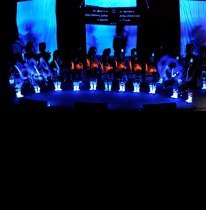
These are some of the test shots we took in class. We used grey face paints as the base with the uv paint over the top. Without the uv light it is really difficult to show how effective these colourful paints can be. The grey face paints seems to be quite dark, therefore we now know next time we need to use more water or use white face paint to make it lighter. Test shots are really helpful because now we know what we need to do to get the best look achievable.


These are some test shots that we took in PDH. This is where we are planning on filming the performance part of the music video. The test shots allowed us to think about the positioning on the drums etc. It was always a chance for us to using PDH lighting. Unfortunately we unable to get the uv lights for this day but I think the lighting looks professional in these test shots. I really like the last test shot on the guitar and think it looks professional. However the guitar because was moving quite a lot so it made the camera pull in and out of focus.

Friday, 18 October 2013

shooting schedule


This is our shooting schedule, these are very important for organisation. The reason for this is because my group consisting of 4 people will need to organise when we can film. We have come up with some dates that we can all do. A shooting schedule is a table which tells the group what dates they will be filming and what they will be filming. On this schedual it will tell the group what they need, for example props and coustumes.

Test Shots


These are some test shots we done in class. We painted Harry's face grey and tested out taking photo's with and without the flash. Clearly in terms of the face paint it looks too blue when the flash is on. We also test the UV lights however we didnt have the UV light so they didn't come up as bright as they would have if we did have a UV light.

Tuesday, 15 October 2013

post 11 - CD cover ideas


\

This is Harry's idea for the album cover. I think his is really good because there are different things and it wouldn't be boring for the person who brought the CD. I like the front cover of the roses in the spotlight, the black background makes it less like a love songs album and more like indie rock. I think he needs to add more colour on the back of the case where the songs will be listed.


This one is my idea for the album cover. I used the splashed paint effect as I've never seen a album cover with that on. It implies it is indie rock because it is paint that has been splashed with force from the person holding the paintbrush and the colours make it the Indie part. I decided to have the back of the cover purple with the border of the splashed paint. This would be ideal because the songs are able to be seem better on a plain background. There are no photos of the band, but silhouettes. I done this because most artist have images of them all over the album cover and this is different so will attract new customers. It also creates this idea of being hidden and the focus isn't on them but on their music. 


Thursday, 10 October 2013

Post 7 - Storyboards


This was my groups first attempt at the anamatic. Story boarding took a long time and we stuggeled comming up with creative shots. We got there in the end and put them in order. We noticed we didn't have as many shots as some of the other groups in our class so we had to come up with more story boards, especially for the narrative. We then had to put them all in order again. We took photos of every frame and uploaded them onto the macs. Once they were all loaded we could begin out anamatic. Unfortunately we didn't take the photos very well or crop them when they were on the macs so some of the shots you can see the rest of the story board. We didn't really cut to the beat and the shots all seemed to last for the same amount of time. Therefore when we go back to our anamatics we will make sure the editing is much better and the shots vary in time.

Thursday, 3 October 2013

Post 5 - Image annotaion


This is out idea of what out band will look like. Unfortunately we wont have as many people in our band. They all look casual and as it they could just be walking down the street. Most indie rock bands are very much like this. They take a casual approach but still look good. They dont look scruffy so we need to insure our band still get the casual look with out looking scruffy and like they have woke up and got dressed in the dark. The difference with rock bands and indie rock bands is the indie is toned down and more uplifting. Their clothes should portray this otherwise the audience will feel confused as to what genre it is.

Post Lyrics annotaion 2